Which is better?
I have two sites about Praha travel.
 This name of site is Access-travel, which introduce hotel price and some information about Praha, also Czech Republic. This site has a strong color that is a original red and a original blue. Therefore, it makes me sick my eyes because main colors are so strong. Also, layout is in bad shape. I have to scroll to down homepage if I search information about Praha travel.
 This name of site is Travel Pages, which include hotel, apartment, and pensions. Also I can see many information at a glance. I think that main site is a little confused for search some information. However, When I quickly search many information, it is the best layout. Also, color is so nice. White's background and cadetblue's text are the best harmony because it gives me relaxation.
About Alignment
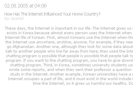
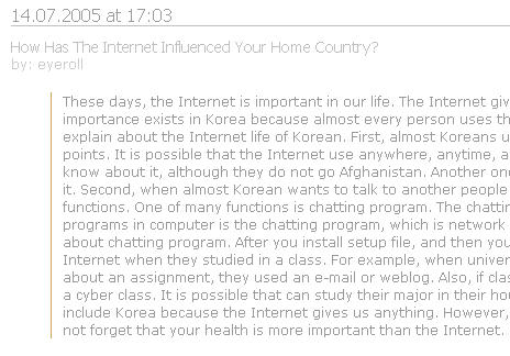
Is alignment good and peaceful? Yes! Alignment is the most important in layout when designer design anything. Look at first picture, it is uncomfortable to see because it does not alignment. When we read some text, a direction is right to left. So, if left area does not alignment in the paragraph, we will feel uncomfortable. Look at this picture! This paragraph is comfortable to see it. Also two lines add in the paragraph, we can read more comfortable text.
I have two sites about Praha travel.
This name of site is Access-travel, which introduce hotel price and some information about Praha, also Czech Republic. This site has a strong color that is a original red and a original blue. Therefore, it makes me sick my eyes because main colors are so strong. Also, layout is in bad shape. I have to scroll to down homepage if I search information about Praha travel. This name of site is Travel Pages, which include hotel, apartment, and pensions. Also I can see many information at a glance. I think that main site is a little confused for search some information. However, When I quickly search many information, it is the best layout. Also, color is so nice. White's background and cadetblue's text are the best harmony because it gives me relaxation.About Alignment
Is alignment good and peaceful? Yes! Alignment is the most important in layout when designer design anything. Look at first picture, it is uncomfortable to see because it does not alignment. When we read some text, a direction is right to left. So, if left area does not alignment in the paragraph, we will feel uncomfortable. Look at this picture! This paragraph is comfortable to see it. Also two lines add in the paragraph, we can read more comfortable text.

About Contrast
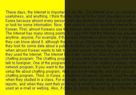 Contrast is necessary between type and background. Make a comparison between yellow background and dark yellow background, we can know which one is better. The most contrast colors are black and yellow. So, yellow background and black text are the most definite couple. But, look at the second example, we can not distinguish because text color and background color is almost the same. However, color's harmony is difference some situation, and color's harmony does not have a formality. I think that if you are comfortable, it is most harmonizable color.


0 comments:
Post a Comment